CONCEPT PROJECT
Financial Partner Platform
A mobile concept for managing clients, portfolios, and business growth
01 / OVERVIEW
Many responsibilities. One daily workspace.
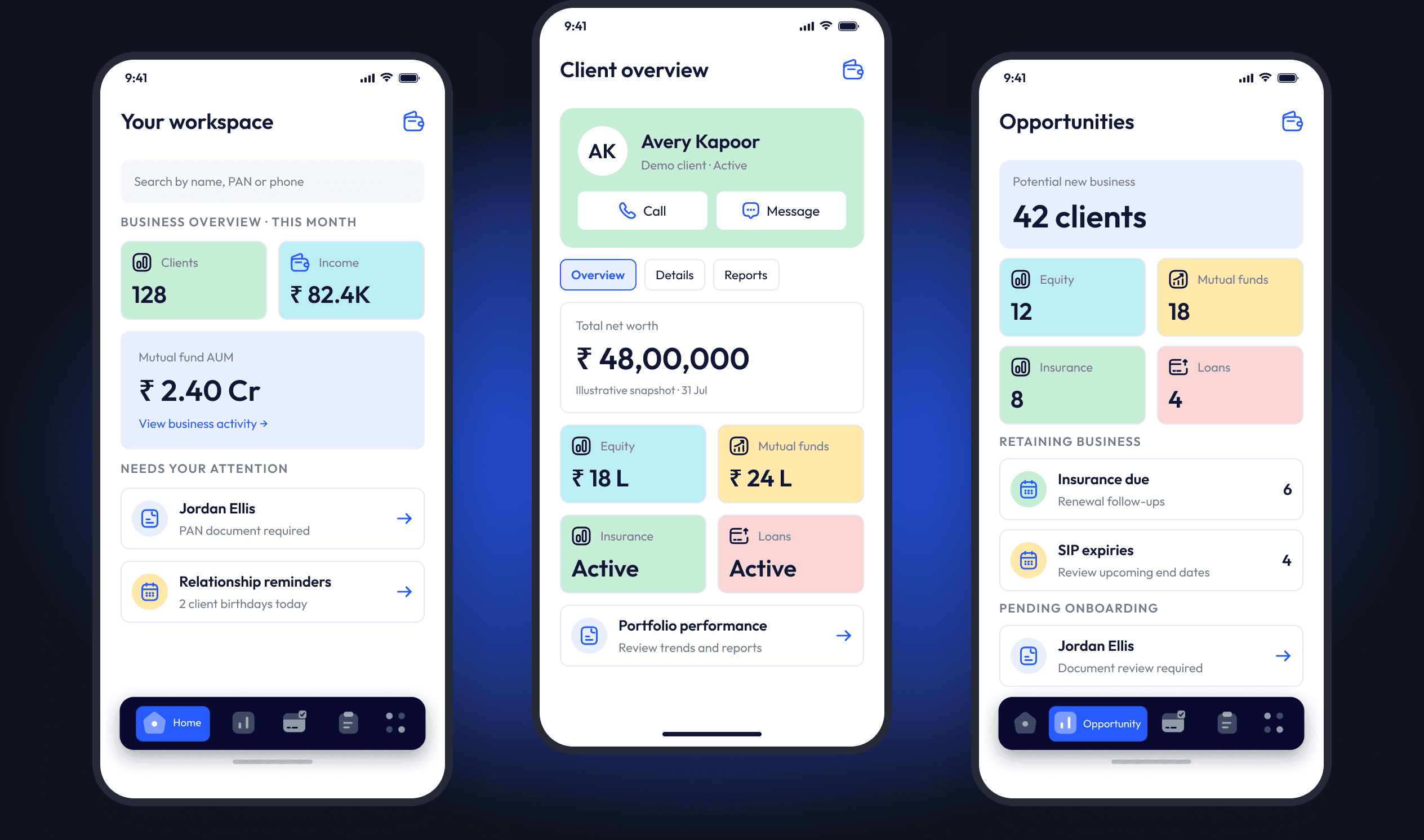
This concept explores how financial advisors and distribution partners could manage daily work through a unified mobile experience.
Client portfolios, business performance, sales opportunities, onboarding tasks and payouts sit together across equity, mutual funds, insurance and loans.
The goal: make complex financial information easier to navigate, while keeping everyday actions accessible.
02 / THE CHALLENGE
Advisory work spans relationships, incomplete applications, investments, renewals and earnings. Fragmented tools can make it difficult to see what needs attention.
How might a mobile application help financial partners understand their business, review client needs, and prioritize their next action?
THE GUIDING DESIGN QUESTION
03 / INTENDED AUDIENCE
For partners managing multiple clients and products.
CONCEPT ASSUMPTIONS · NOT VALIDATED RESEARCH
These needs frame the design exploration. They are assumptions to investigate with advisors and distribution partners, not findings from completed research.
Business at a glance
Quickly review performance and understand what needs attention.
Client context
Find client information and understand portfolios across products.
Timely follow-ups
Stay aware of incomplete onboarding and upcoming renewals.
Clear earnings
Track commissions and understand product-specific payout schedules.
Product depth
Move from a consolidated portfolio to the detail behind it.
Everyday support
Access learning resources, marketing materials and sales support.
04 / THE SOLUTION
A clearer starting point. A more useful next step.
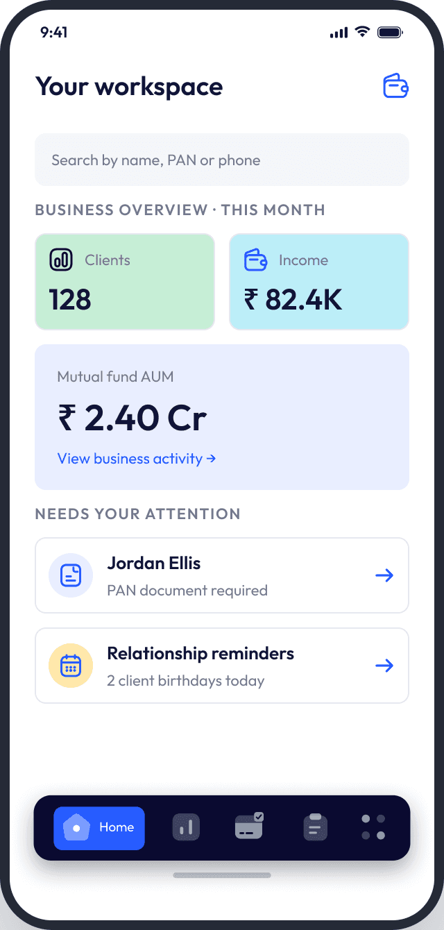
The concept connects a high-level business view with the follow-ups that give those numbers meaning.
 OVERVIEW → ATTENTION → FOLLOW-UP
An action-oriented dashboard
Business metrics sit alongside document follow-ups and relationship reminders. Search by name, PAN or phone number keeps client lookup close at hand.
Intent / Connect business overview with practical next steps.
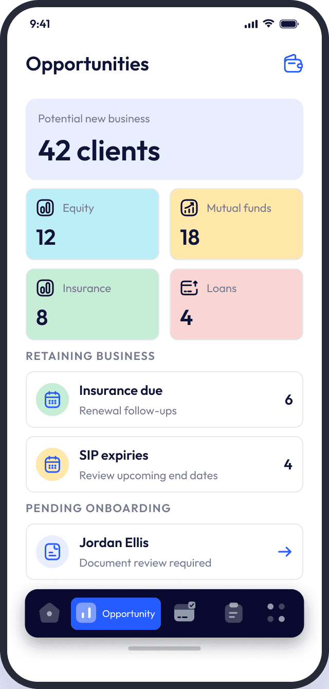 NEW BUSINESS ≠ RETENTION
A structured opportunity view
Potential business is grouped by product category. Insurance dues, SIP expiries and pending onboarding are separated into focused follow-up areas.
Intent / Distinguish acquisition from retention and prioritize follow-ups.
Screen values demonstrate interface hierarchy, not measured project outcomes. All people and financial data shown are fictitious.
04 / THE SOLUTION, CONTINUED
Keep the client in view. Go deeper when needed.
From a portfolio review to a client conversation, the intent is to balance an accessible overview with deeper product information.
C / CONSOLIDATED CLIENT OVERVIEW
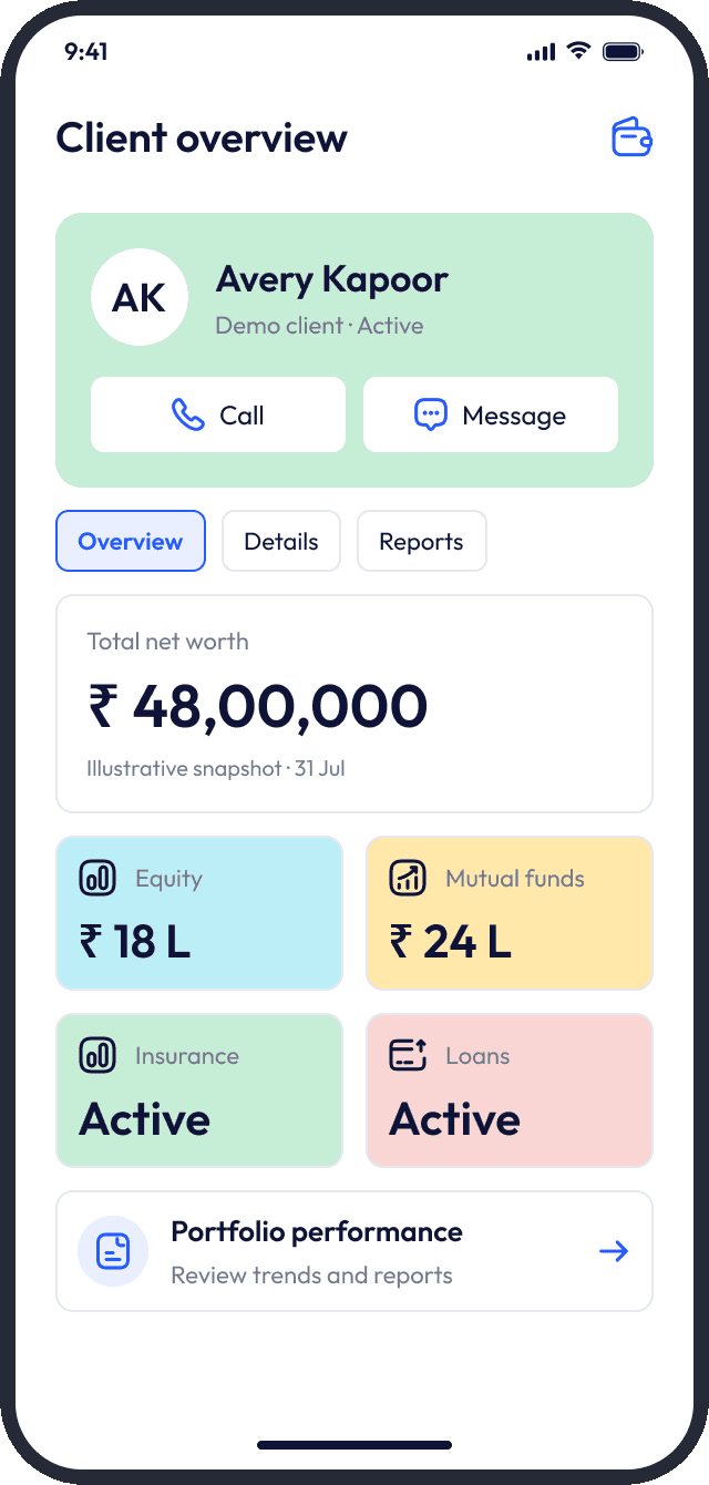
Context before conversation
Profile, contact actions, net worth, product relationships and performance share one overview. Overview, Details and Reports keep the context close.
D / PRODUCT-SPECIFIC DEPTH
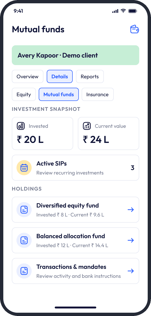
Detail without losing the client
Mutual-fund holdings lead to active SIPs, transactions, mandates and investment-entry screens. Dedicated equity, insurance and loan views extend the same structure.
D / PORTFOLIO ANALYSIS
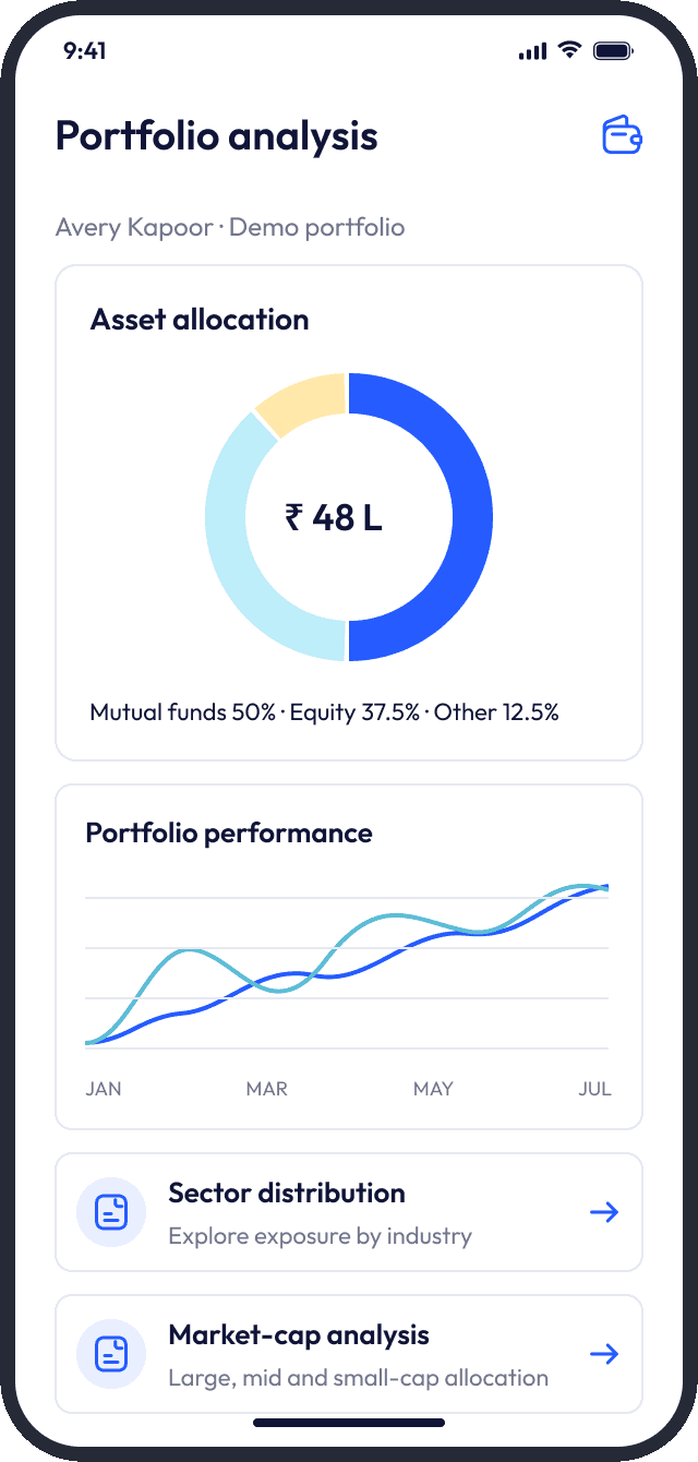
Understand what sits underneath
Asset allocation, sector distribution and market-cap analysis add a deeper perspective alongside portfolio performance.
04 / E — BUSINESS OPERATIONS & ENABLEMENT
Beyond the portfolio.
The advisor’s daily workspace extends beyond investments. Earnings, learning and sales support belong in the same experience.
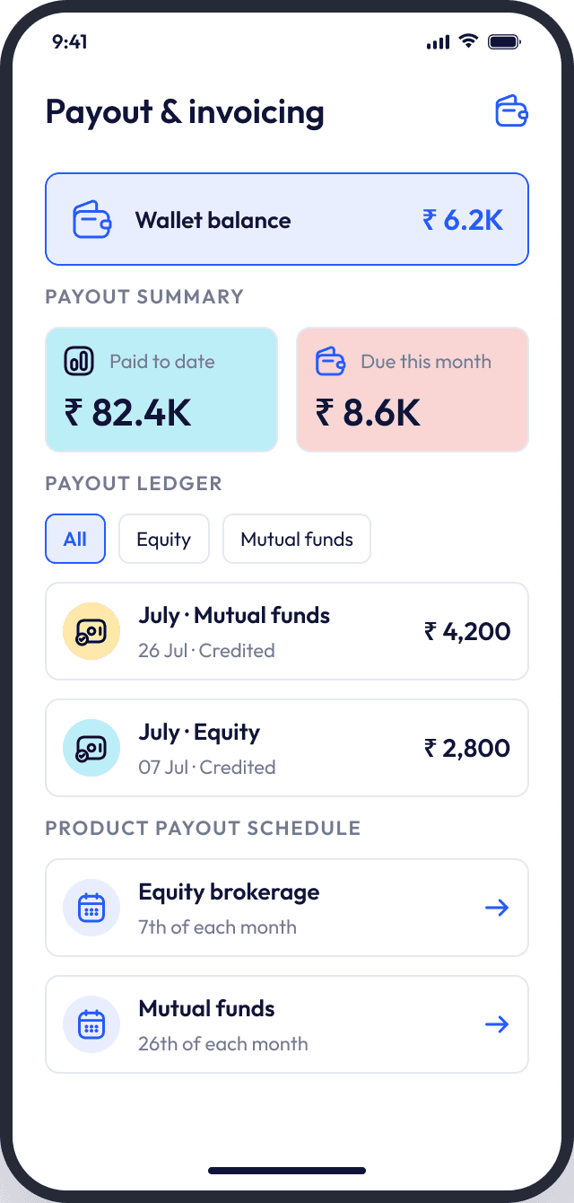
Make earnings understandable
Payout summaries and ledgers sit alongside product-specific schedules, so partners can distinguish what has been paid from what is due.
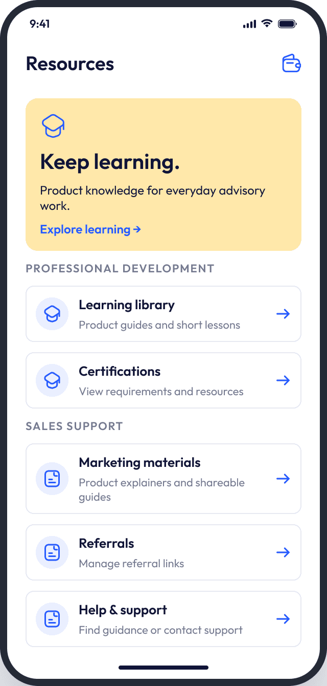
Keep support within reach
Learning, certifications, marketing materials, referrals and support address the broader responsibilities of financial partners.
Intent / Support the work around the client relationship, not just the portfolio itself.
05 / VISUAL DIRECTION
Light, compact and clearly grouped.
The application’s direction uses light surfaces, compact cards, blue accents, contrasting bottom navigation, pastel product tiles and charts. Vertically grouped information supports a mobile reading rhythm—distinct from this case study’s oversized editorial styling.
APPLICATION TYPOGRAPHY / OUTFIT
A friendly geometric voice for compact financial information.
APPLICATION LANGUAGE / PRODUCT TILES & HIERARCHY
Pastel categories differentiate products; blue consistently marks actions and selection.
06 / KEY DESIGN TRADEOFFS
Breadth needs structure.
The concept is a set of design choices, not proof that every responsibility fits comfortably on a mobile screen.
07 / PROPOSED VALIDATION
What needs to be tested next.
PROPOSED, NOT COMPLETED
A next step would be task-based usability assessment with representative financial partners, focusing on comprehension, findability and prioritization.
Concept project — no measured outcomes are claimed.
08 / REFLECTION
Connect the business.
Keep the client close.
Make the next step clear.
This exploration brings business performance, client context and actionable follow-ups into a coherent daily workspace. Its value lies in the connections between those layers—not simply in the number of features on a screen.
The next challenge is to assess whether that breadth remains understandable in real advisory work. The concept is a direction to validate, not a claim of proven impact.