
- Online accounting
- Taxation
- CFO services
Case study · Accounting SaaS · UAE
Kitaab
An AI-powered financial operating system that brings bookkeeping, VAT, corporate tax and reporting together for UAE startups and SMEs.
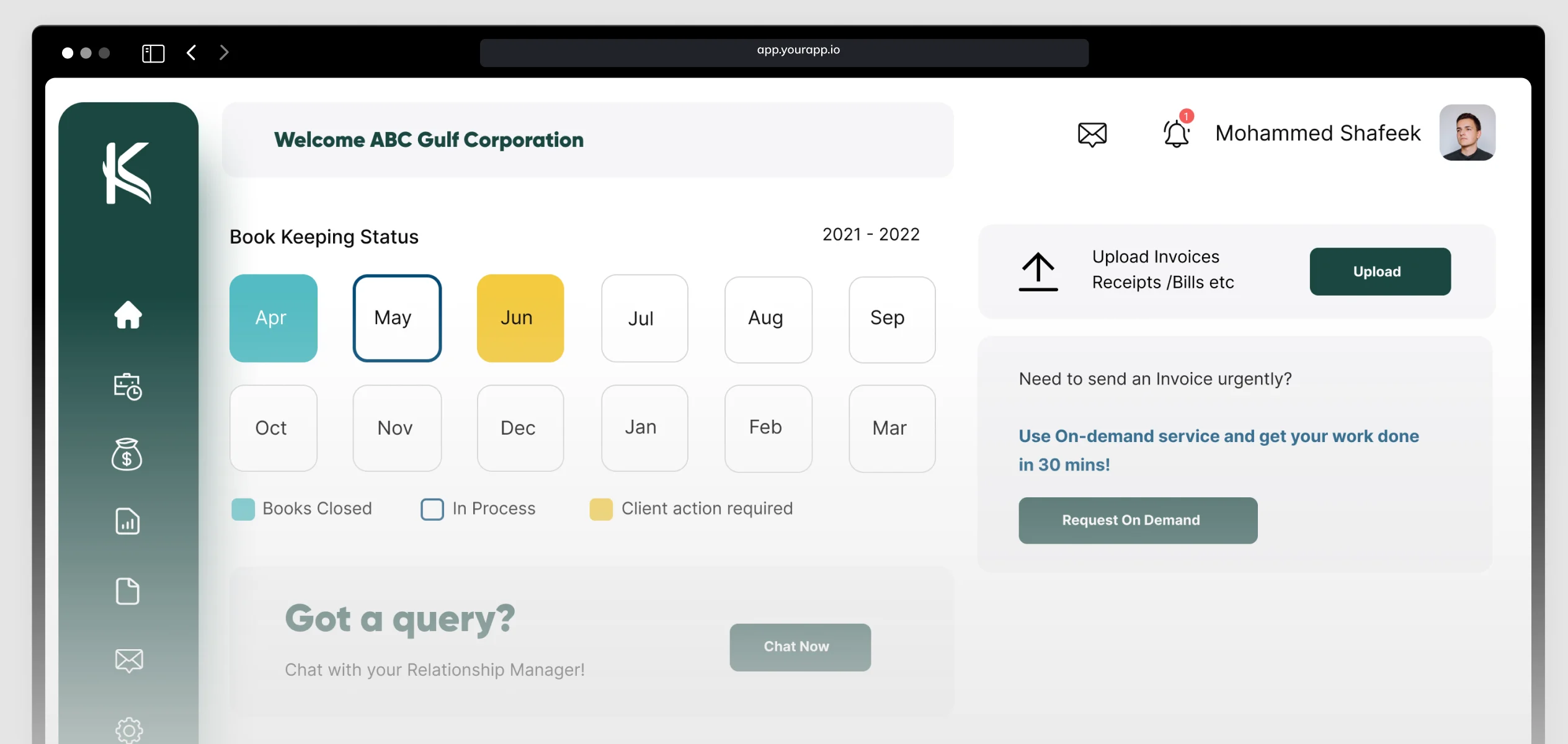
Kitaab is an internal application, so every screen shown here is a representation of the actual work, not the production product.
01 / Overview
Every part of a business’s finances, in one calm workspace.
Kitaab.ai is an AI-powered financial operating system built for startups, entrepreneurs and SMEs in the UAE. It brings bookkeeping, accounting, VAT, corporate tax, compliance and financial reporting into a single digital experience.
The objective was to simplify complex financial workflows while giving users clarity, transparency and confidence in managing their business finances.
My role
Lead UI/UX Designer
I led the UI/UX design for the platform, working closely with the Business Analyst, Project Manager and development team. They defined the business requirements and user flows together; I turned them into intuitive experiences through wireframes, high-fidelity designs, interactive prototypes and a scalable design system.
Delivered
Worked with
02 / The challenge
Financial platforms often present large amounts of information and technical terminology, making them hard to navigate for people who aren’t accountants.
The challenge was to simplify complex workflows while keeping the accuracy and functionality that financial operations demand.
How might we keep every number accurate and available, without making business owners feel like they need an accounting degree?
The guiding design question
03 / Goals
What the design had to do.
Simplify
Make complex financial workflows simple to follow.
Navigate
Improve navigation and task completion across modules.
Systemise
Create a consistent and scalable design system.
Build trust
Use clear, transparent interactions around every number.
Respond
Design one responsive experience for desktop and mobile.
04 / The key decision
Show less, on purpose.
Financial software tends to show everything at once — every line item, field and number — on the theory that more visibility means more transparency. In practice, it overwhelms users who don’t yet know what’s important.
Why
Visual hierarchy alone still leaves every number on screen, competing for attention even when styled to recede. For financial data the goal wasn’t just helping users find the important number faster — it was reducing how much a non-financial user has to process just to feel oriented. Progressive disclosure removes the competing information rather than de-emphasising it: a stronger version of the same goal.
Nothing users needed was hidden — it was one tap away. It just wasn’t on screen by default, competing for attention.
05 / Wireframes
Structure before style.
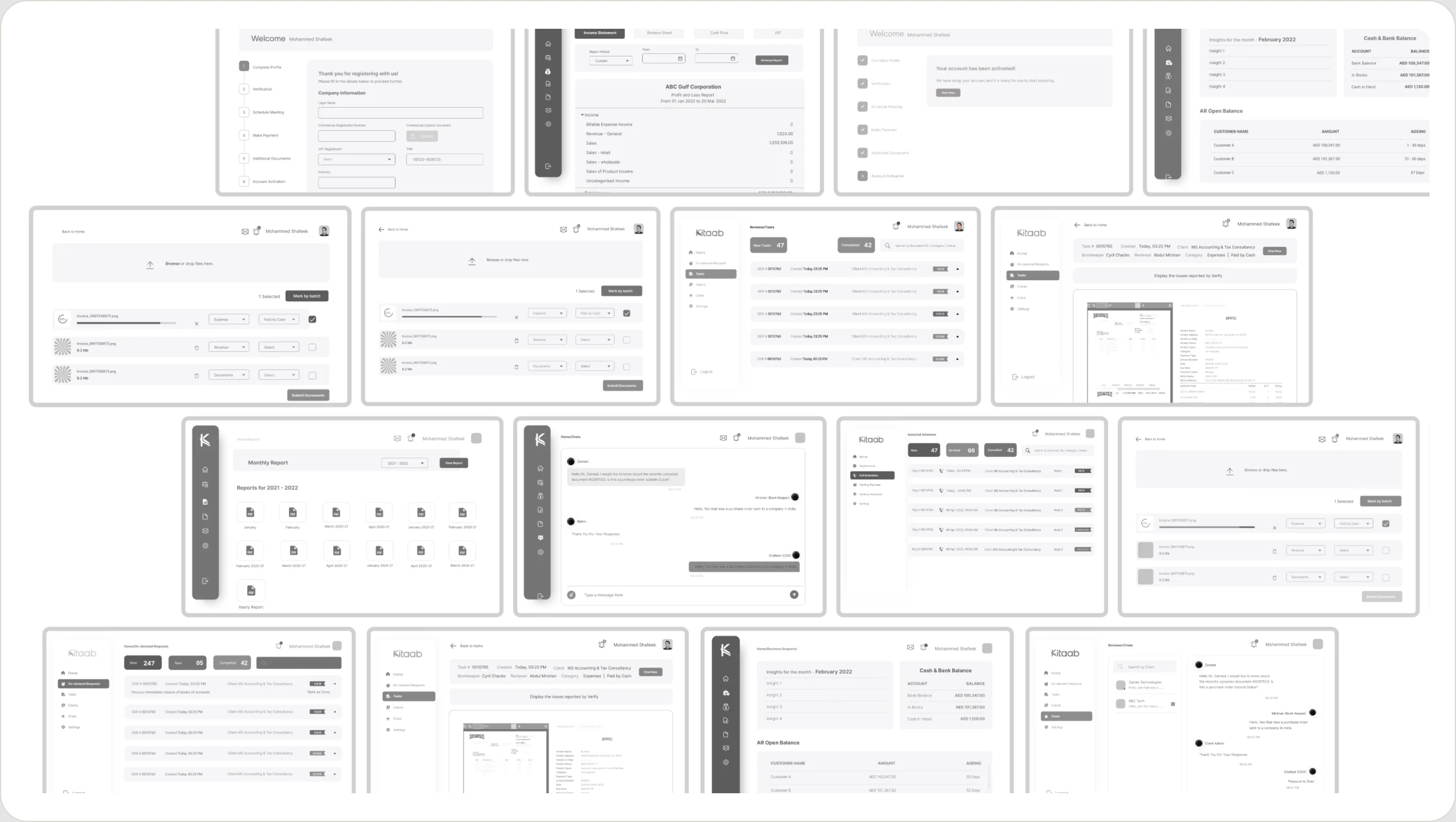
Low-fidelity wireframes mapped the flows from the Business Analyst and Project Manager into screens, so layout and disclosure decisions could be agreed before any visual design.
06 / High-fidelity design
A calm, guided financial workspace.
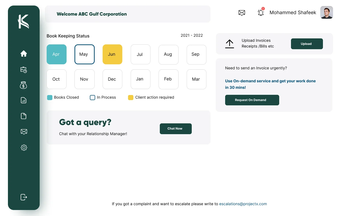
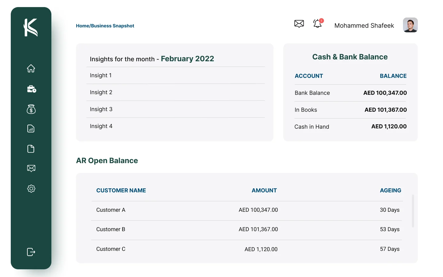
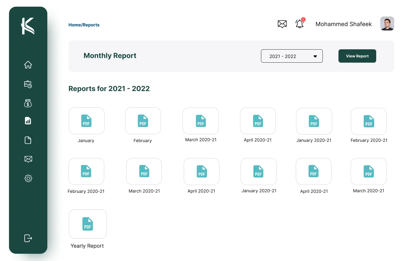
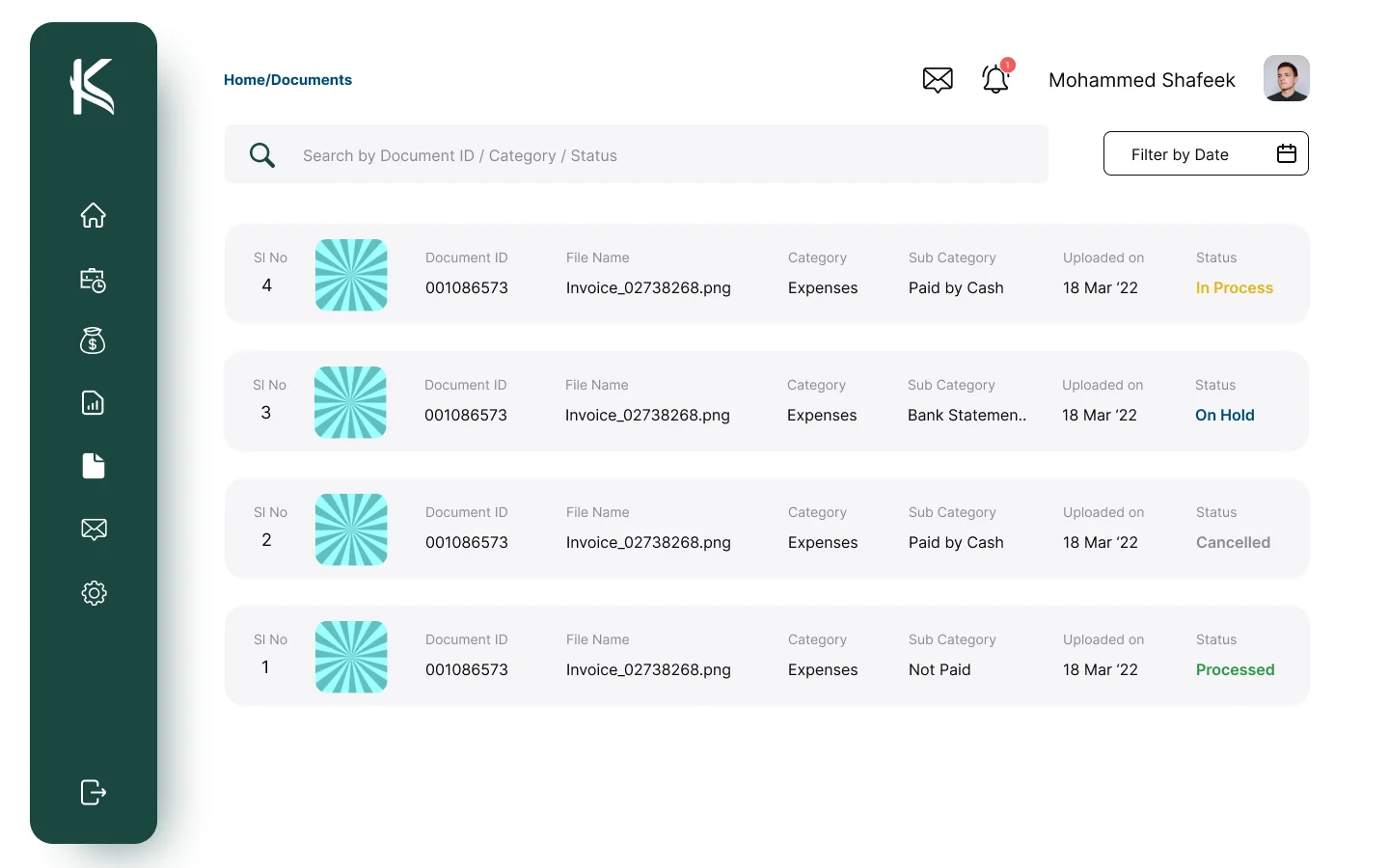
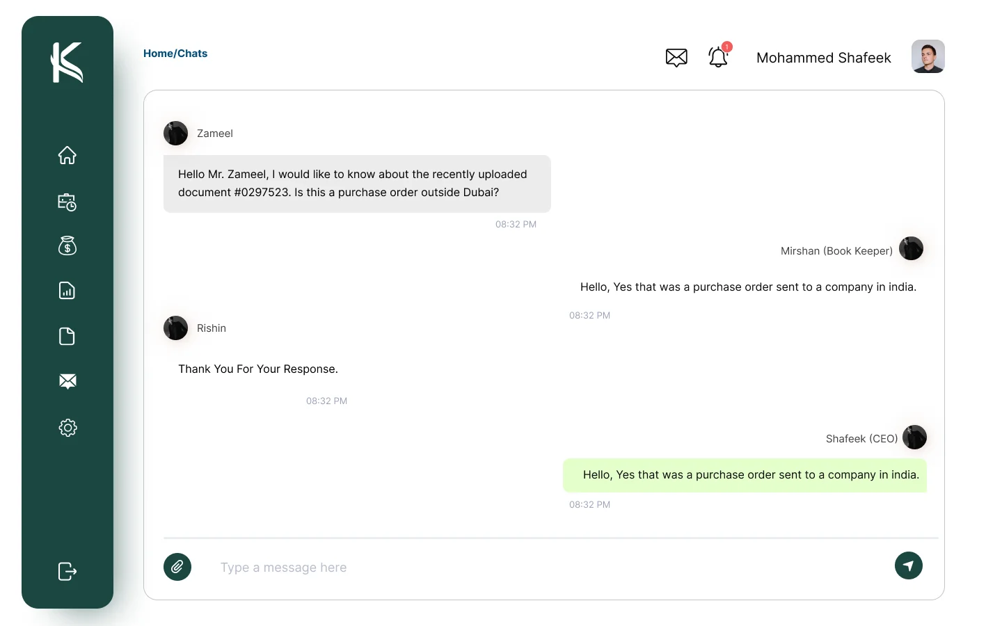
Deep green for trust, lime for focus and plenty of white space. Each screen leads with a summary and keeps the next action close, so business owners always know where their books stand.
Built for every role
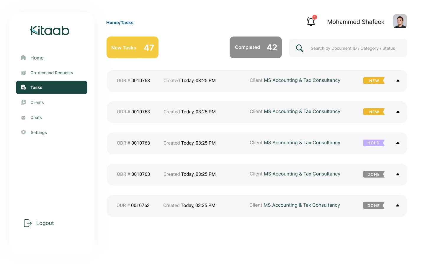
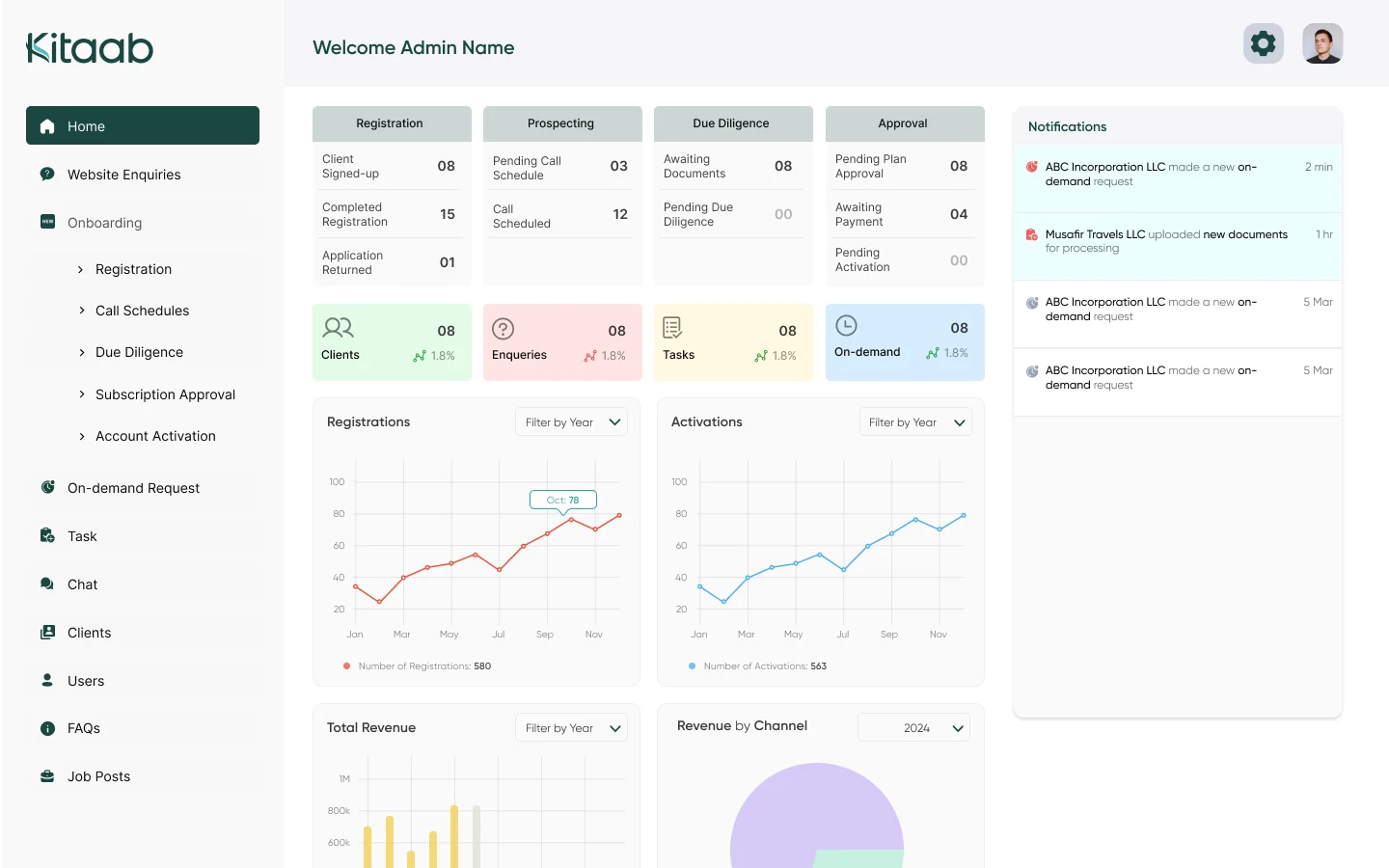
The same design system extends to the people behind the books: bookkeepers, reviewers and the super admin.
Responsive
The same clarity on a phone.
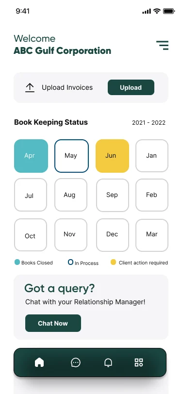
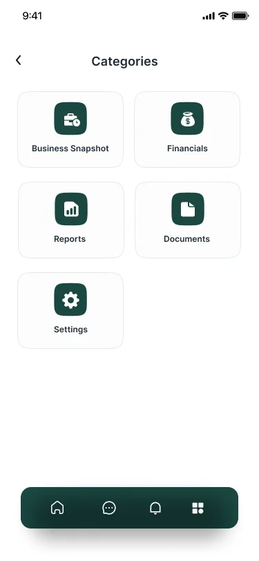
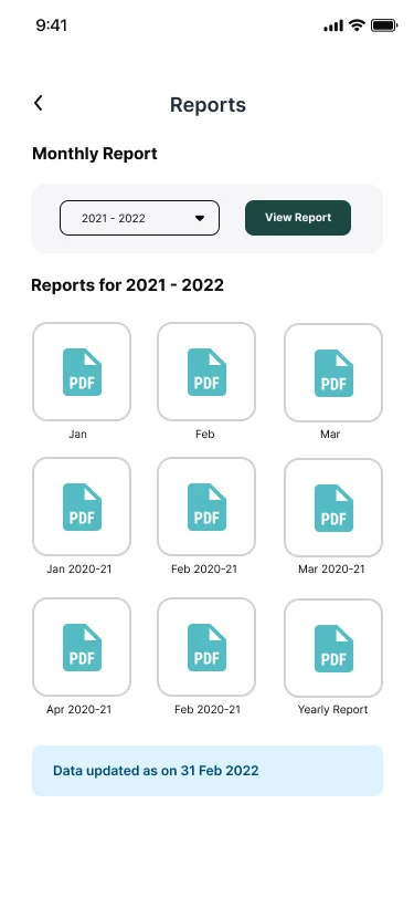
Summaries stack into cards and navigation moves to a menu, so owners can check their numbers on the go.
 Home
Home Financials
 Categories
 Reports
 Settings