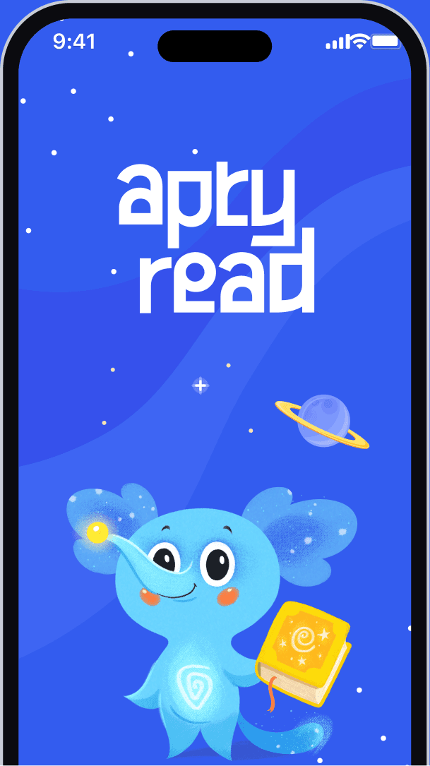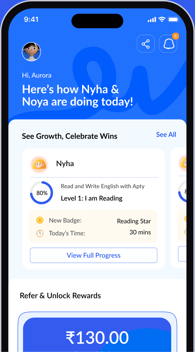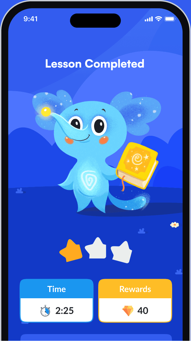
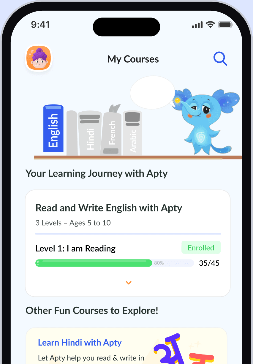
AptyRead is an AI reading tutor that helps kids aged 5–10 read, write and speak English with Apty, a friendly AI buddy.

Children aged 5–10 learn to read by listening, repeating and trying — yet most reading apps expect them to read the instructions first. And parents can’t easily tell whether screen time is turning into real progress.
 Apty saysFantastic! You’re so good at this!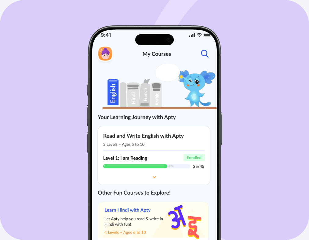
How might we make learning to read feel
clear, achievable, and rewarding?
Learning is cumulative
Parents need visibility
The real challenge
Progress over engagement.
Rather than treating engagement as the primary measure of success, the design direction prioritises meaningful learning progress.
Learning clarity
Structured progression
Parent confidence
Project Goals
Voice-first learning
A tutor, not a textbook
Progress kids can feel
Parents stay in control
Two users, one learning model.
Early-reader children and the parents behind them. Their needs below are initial hypotheses to validate — not findings from documented interviews.
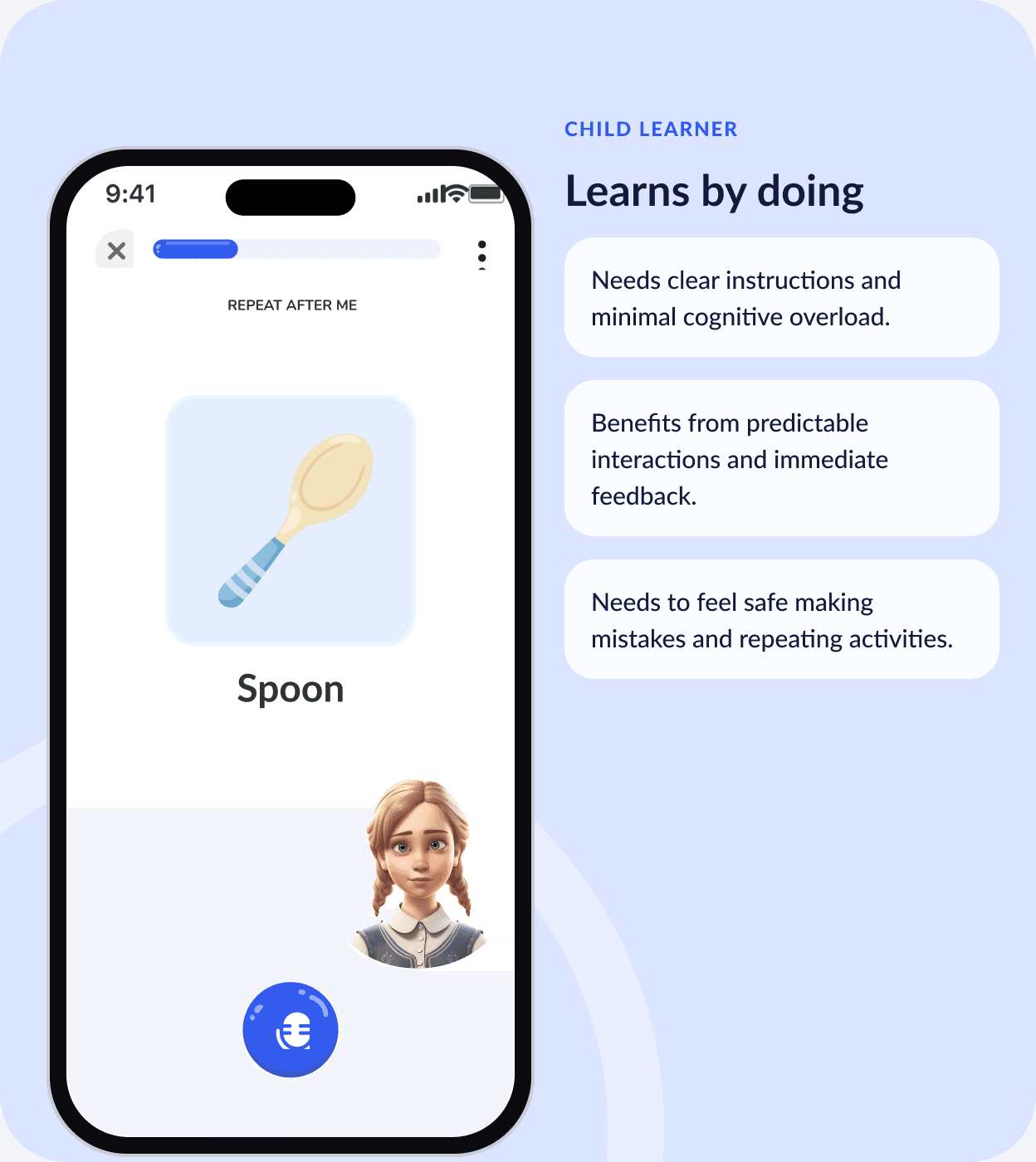
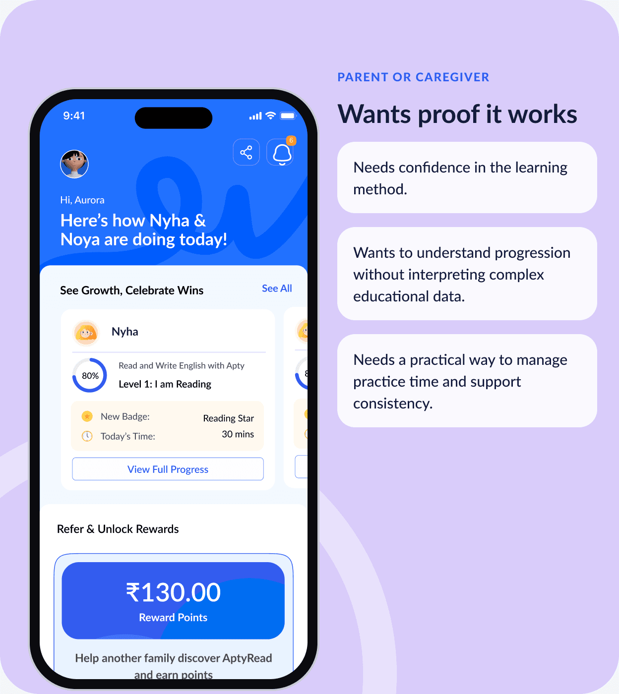
Design implication: the child-facing experience and the parent-facing controls serve different purposes. They are connected through the same learning model, but they should never compete for attention on the same screen.
One clear path through every lesson.
Learning is organised around a clear progression. Each lesson supports a specific skill, and the next step emerges naturally from completion.
Design Process
Five stages took AptyRead from a lesson idea to finished screens. Each one answered a single question and produced something the next stage could build on.
Low Fidelity Design
For low fidelity, we shaped each screen with simple blocks, mapped the interactions without distraction and checked the navigation before moving into visuals.
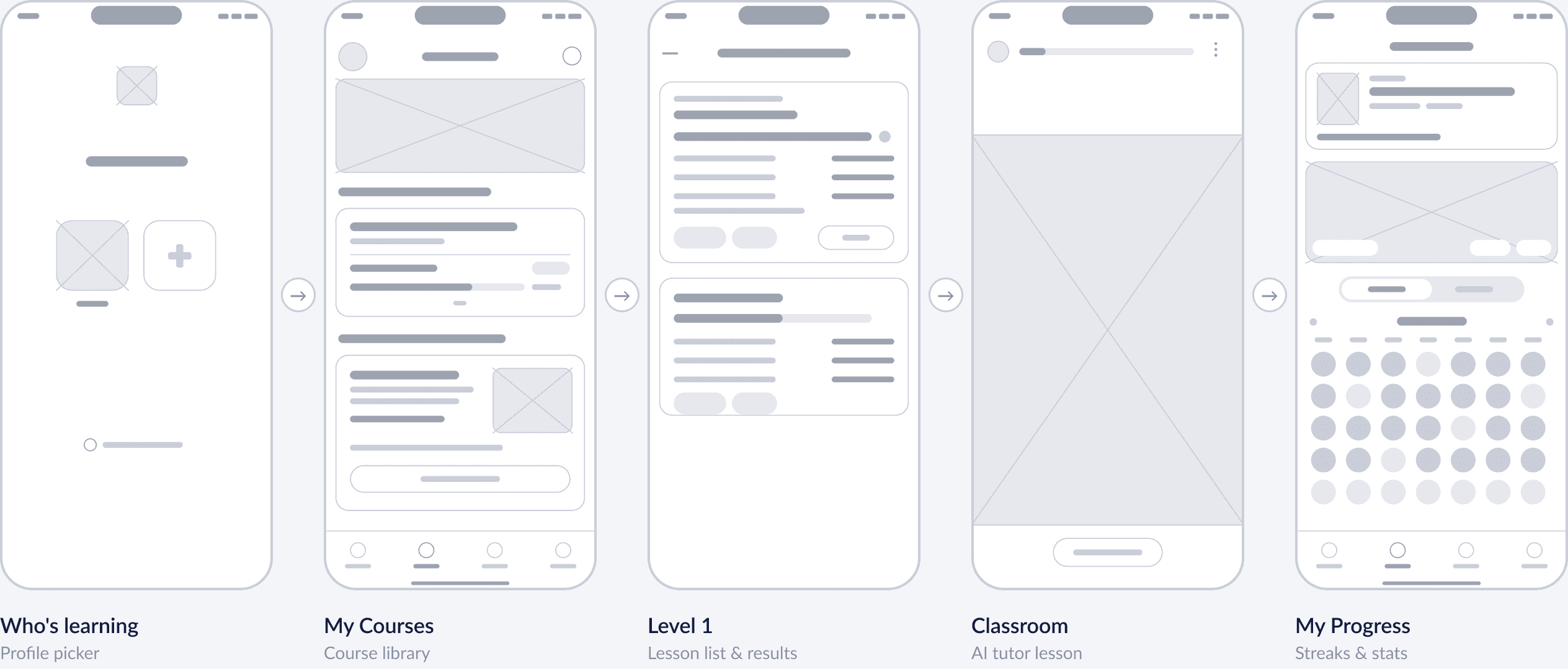
Wireframes re-drawn from the final screens to show structure.
Turning Wireframes Into Wow Moments
What began as simple layouts grew into bright, character-led screens with Apty, the AI tutor and rewards that make young learners want to come back.
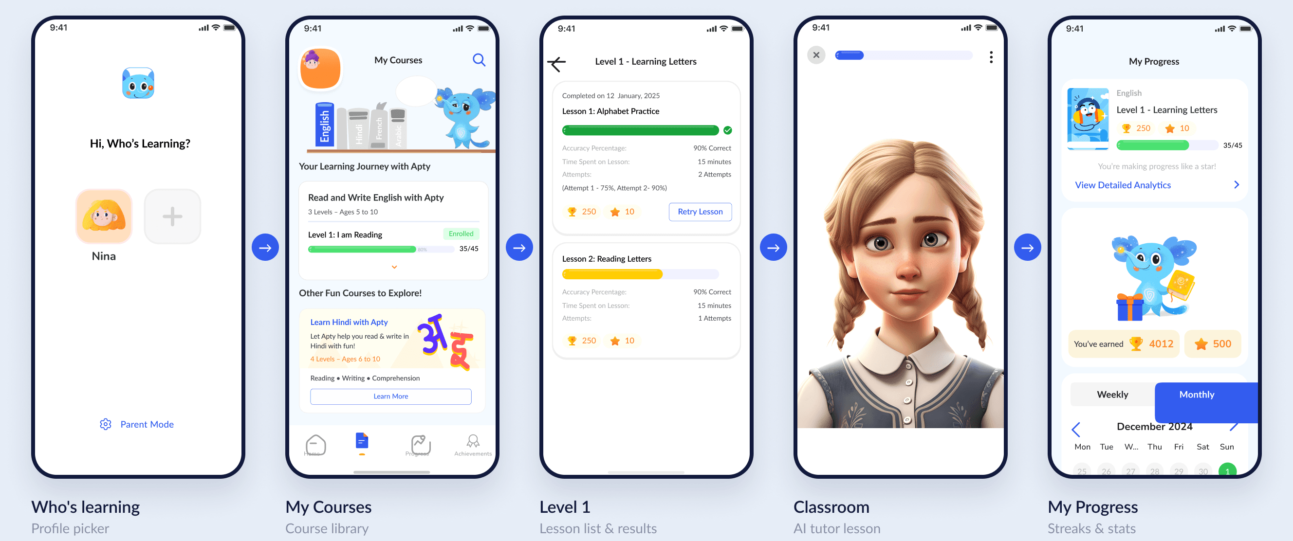
Four decisions that shaped the experience.
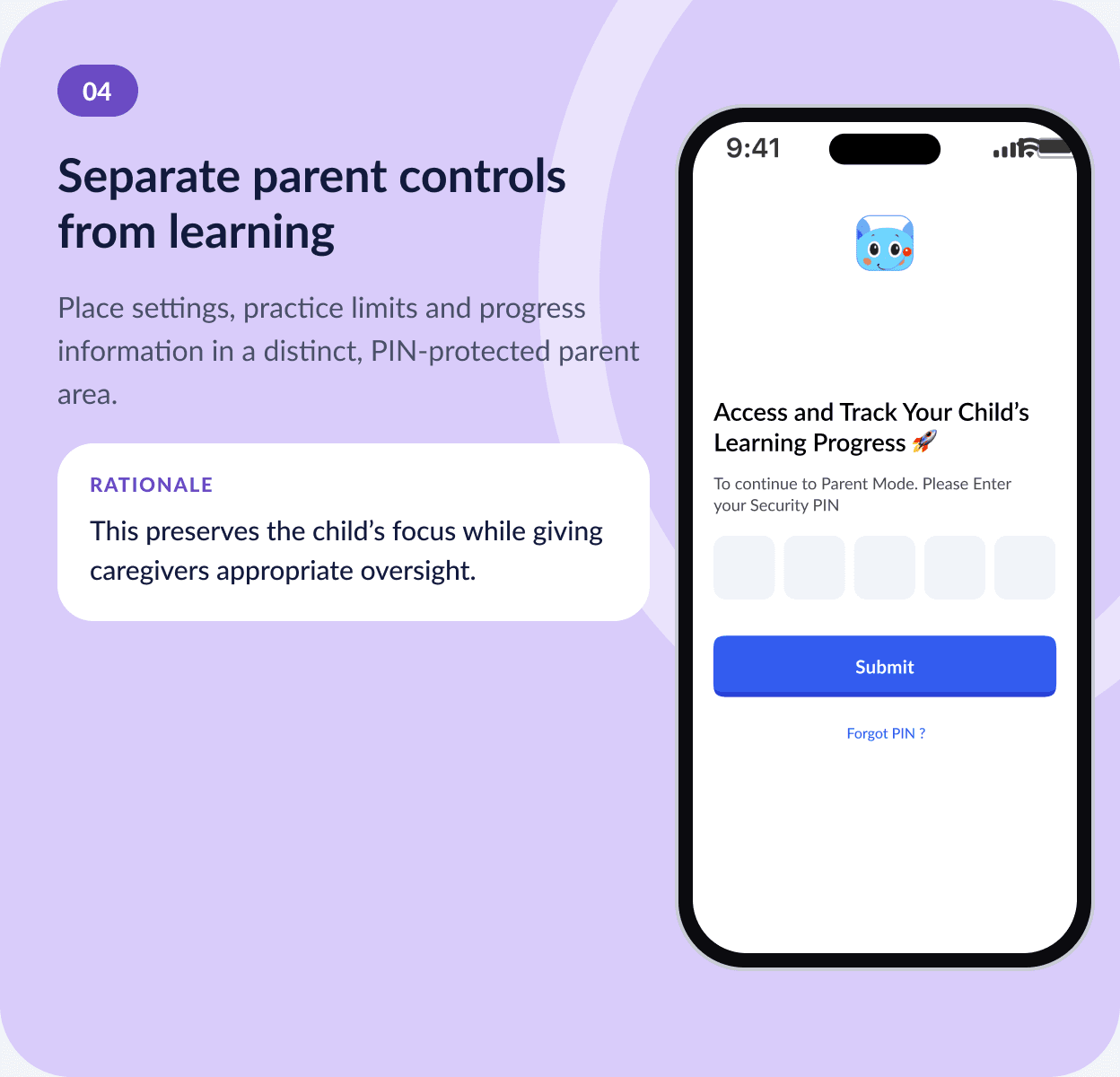
Each decision traces back to the strategy: clarity for the child, visible progression, and a parent area that never interrupts learning.
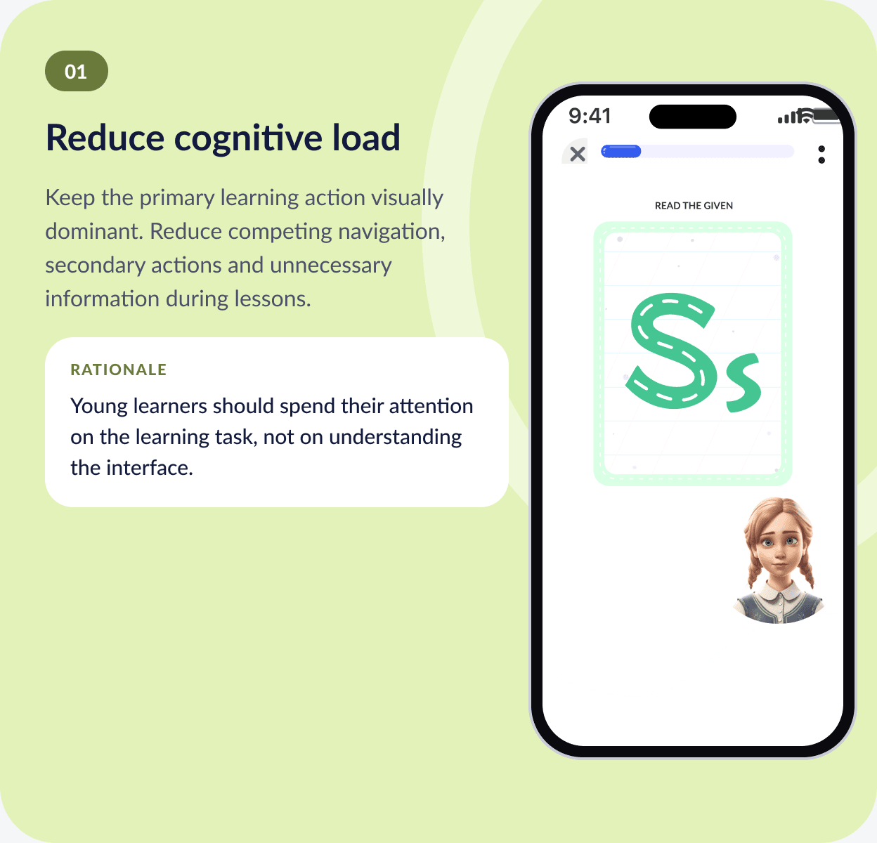
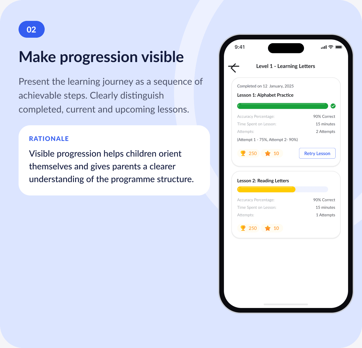
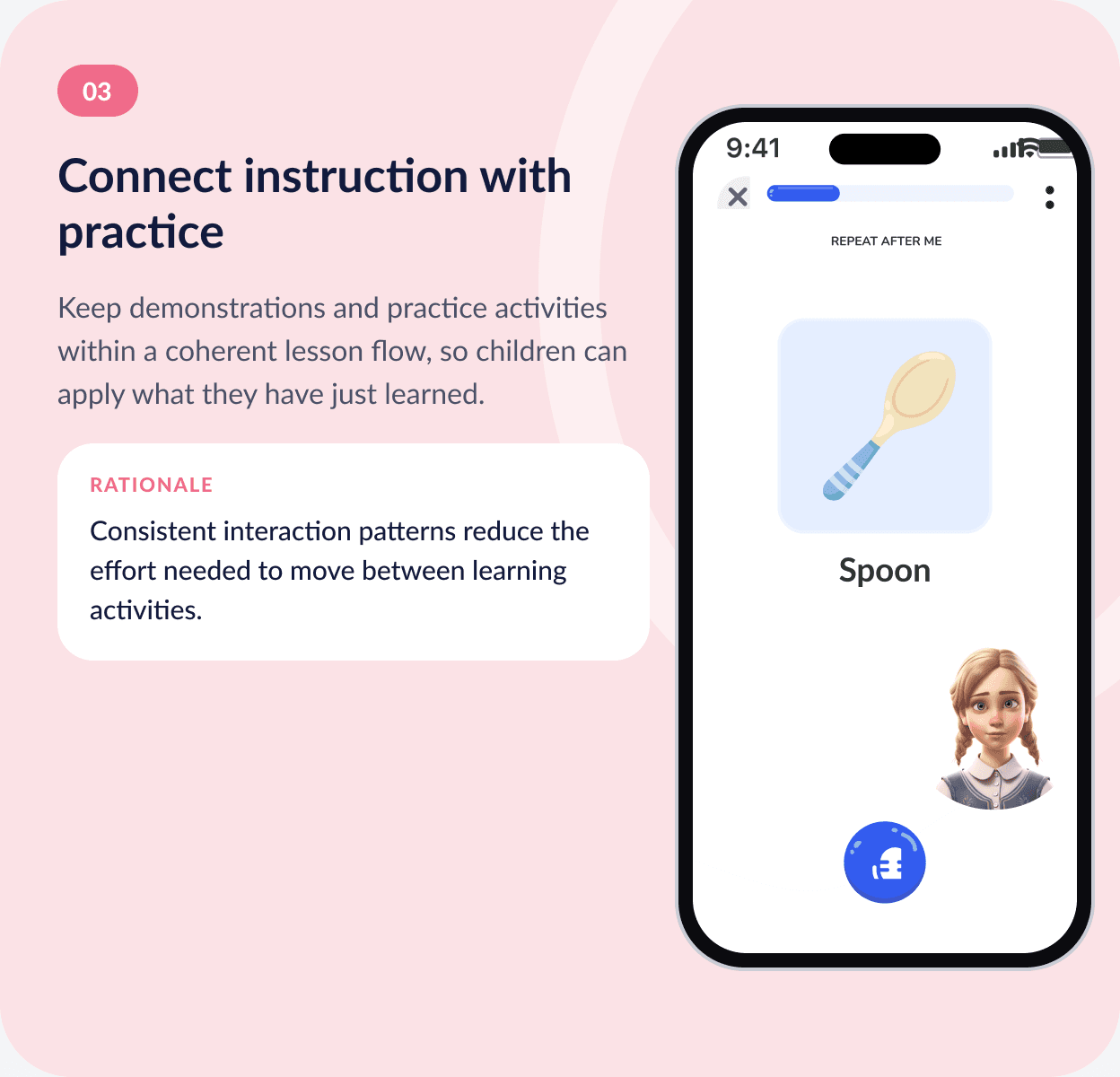
Built to scale across letters, levels and learners.
A scalable learning product needs more than a consistent visual style. Its system must support repeated lesson patterns, multiple levels, accessibility and future content.
Interaction consistency
Visual hierarchy
Accessible feedback
Touch usability
Content scalability
STATES WITHOUT RELYING ON COLOUR
Define success before claiming it.
How the design will be evaluated, set out before any claim that it improved outcomes.
Next step: usability testing with children and caregivers, using age-appropriate research methods and parental consent. Baseline and post-design measurements would then show whether the experience improves usability and supports learning.
Evidence, not assumptions.
Success will be judged on evidence from real use. These are the measures the design is set up to move:
Lesson completion rate
To be measuredNavigation errors and requests for help
To be measuredSuccessful completion of key learning tasks
To be measuredParent understanding of learning progress
To be measuredLesson abandonment
To be measuredResults: to be added from analytics, usability tests or stakeholder feedback. No numerical improvements have been assumed.
Simplicity with educational depth.
Designing for early literacy means balancing simplicity with educational depth. The most important question is not how to make every lesson more entertaining, but how to make each learning step understandable, purposeful and achievable.
The broader lesson: educational UX should be evaluated through both usability and learning outcomes. A clear interface is valuable, but its real contribution is helping learners engage with the content and move forward with confidence.
Learning that feels like play.
AptyRead turns reading practice into a short, voice-led adventure for children — and gives parents a clear, calm view of the progress behind it.